Dr. Roy Margenau III
Scope of Work: Rebrand, Brand Strategy, Brand Messaging, Mission, Visual Identity, Logo Design, Packaging Design, Print Design

ABOUT THE BRAND
Dr. Roy Margenau III Family Dentistry, located in a historic church in Dexter, MI, has been a trusted dental practice for 40 years. Known for their use of high-quality, non-metal materials, Dr. Margenau and his dedicated team have built a loyal patient base through their commitment to excellence and family-oriented care. Their practice stands as a pillar of trust and superior service in the community.
THE CHALLENGE
Despite being in business for 40 years, Dr. Roy Margenau III Family Dentistry had never established a cohesive brand identity. Their existing website was outdated and lacked a proper domain name. While they enjoyed long-standing relationships with their loyal patients, the expanding family-oriented community in Dexter, MI, presented an opportunity to attract new clients. The challenge was to create a compelling brand and digital presence that would resonate with both existing and potential new families.
OUTCOME
Randi Design Co. successfully managed the complete branding and web design project for Dr. Roy Margenau III Family Dentistry. This included creating a versatile logo design, establishing a cohesive color palette, selecting appropriate typography, and developing unique patterns and marketing materials. Additionally, we designed a new website featuring an easy-to-navigate and informative user experience, complete with a proper domain name to enhance SEO. This comprehensive rebranding effort has revitalized their online presence and positioned the practice to attract new families in the expanding community.


REBRAND STRATEGY & VISUAL IDENTITY
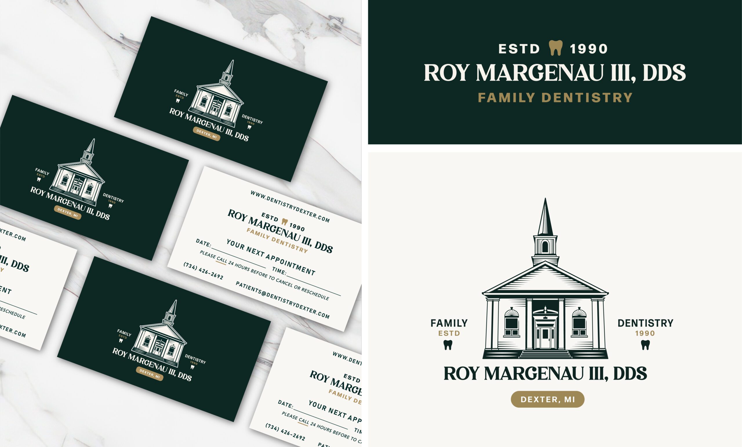
To revitalize Dr. Roy Margenau III Family Dentistry’s brand, we conducted a thorough competitor analysis and identified a target audience that is predominantly local. The goal was to modernize the brand while preserving the vintage charm of the historic church building, which the client holds in high regard. The updated brand strategy included a versatile logo featuring the iconic church building, a sophisticated color palette, and a blend of classic and clean typography. These elements were designed to reflect the practice’s long-standing presence and historical significance while appealing to modern sensibilities.
The rebranding effort also included developing unique patterns and cohesive marketing materials, ensuring a consistent and recognizable presence across all platforms. This comprehensive approach led to a significant increase in new family clients and referrals, solidifying Dr. Roy Margenau III Family Dentistry’s position in the expanding community of Dexter, MI. The client is proud of the new brand, which beautifully highlights the historic building while attracting new patients.
LOGO STRATEGY
For Dr. Roy Margenau III Family Dentistry, we developed both a primary and secondary logo to meet the client’s needs and comply with local regulations. The primary logo prominently features the historic church building, reflecting the client’s desire to showcase the practice’s unique and cherished location. Additionally, we created a text-only secondary logo for marketing purposes, ensuring compliance with the city of Dexter’s signage laws, which restrict heavy graphics. This dual approach allows the practice to leverage the iconic imagery of their building while maintaining a strong and versatile brand presence across all marketing materials and signage.

website design
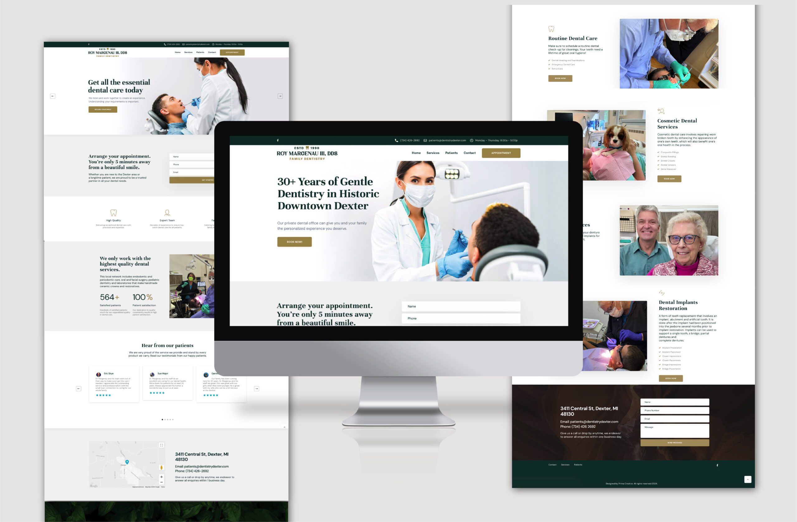
For the website of Dr. Roy Margenau III Family Dentistry, we aimed to create an informative yet user-friendly experience with a memorable domain name, dentistrydexter.com, avoiding the need for the lengthy full name of the doctor. The site is rich with content, featuring numerous calls to action, personable photos, maps, and all the essential information new patients need. This includes downloadable documents that can be submitted online and step-by-step instructions on what to expect during their visit.
To add a local touch, we ensured the office dog, Remy, who is very popular in the area, was featured on the site. As a result of these enhancements, the practice has seen an increase in new clients, who appreciate the ease of access to information and the welcoming, informative online presence. Additionally, the staff has noticed a significant decrease in clients calling with confusion about registration or scheduling appointments, allowing them to focus more on their work.
Designers
Miranda Flinchum
Jackie M.

